
Heyo every-people! Things are coming along nicely here at Radical Stallion, but in the meantime, let's have a history lesson...
If you look to your left (or above if you're on the phone right now), you'll see our current logo. As you can tell, it's easily earned the 'Radical' part of our co-op's name, and you can thank Marsh for that.
('That' being both the logo and the fact that we're a co-op! The name was my idea though eheheh >:D )
But back when Radical Stallion was but a twinkle in our eyes, I did dabble in some logos myself. Thankfully those were never official, but I thought it'd be fun to make a longer post to look back at how far our logo has come, from the conceptual MS Paint days to all of Marsh's kick-ass designs!
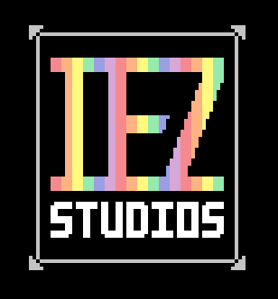
1. IEZ Studios
This is a relic from the "wouldn't it be cool if...?" era, a time years before any of this seemed remotely feasible. 'IEZ' was the acronym for our private discord server. The meaning of the letters has, unfortunately, been lost to time. Still, a decent retro logo for a studio that doesn't exist. That's right, the trademark is yours to take! Do it! It'll be funny!
2. Rainbow Unicorn
After a long and winding road of picking a name for ourselves, I tried my hand at a concept for what this 'radical stallion' would look like, using the ancient art of tracing over a stock image! While the vast majority of this design was scrapped, the shutter shades somehow endured...

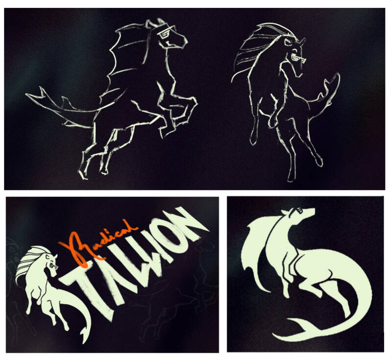
3. Marsh Starts Cooking...
Kelsey the Kelpie is born! Initially more horsey, her utility as the 'S' in Stallion is too great an opportunity to pass up, and she develops a more curved aquatic look.
A part of us will always miss that raised eyebrow though. It was too powerful for this world.
4. The Temp Job
That's right, this was technically our first 'official' logo, used for a whopping 14 days or so while Marsh made the first actual one. Anyone reading who was around for the orange era, you're a real one. Respect.
5. Coastal Arch
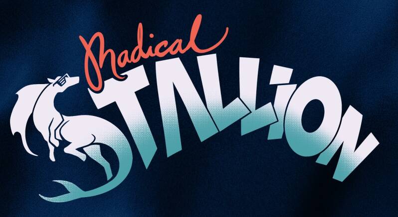
Now THIS is a logo! We explored a lot of different colour combinations, including an eldritch purple that we really liked, but settled on the light blue and orange for that bright seaside feeling.
With all the variants sorted, this logo was set to be our bat-signal to the world wide world, and took pride of place on our website and socials for nearly five months. Until along came...
6. Jagged Flame
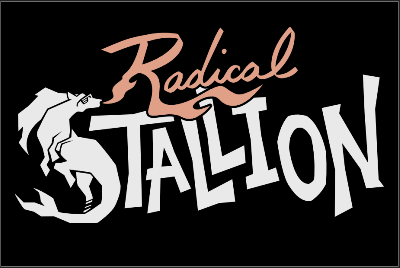
The previous logo did have some issues, namely the design elements being too left-skewed, and the gradient causing issues on occasion. This new logo cleans up the colors to make it way more versatile, and thanks to a suggestion from Justen, Kelsey can now breathe fire. An objectively cool choice to complement the jagged edge of this logo.
But...what if we went even cooler? And added EVEN MORE FIRE?
7. Blazing Kelsey
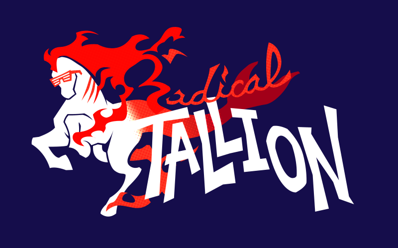
Halfway through 2026, the latest and greatest of our logos came to be. Our mascot is on FULL display here, returning to the more horse-like form of old but with that new fire in her heart.
This logo also adds some much-needed colour into our profile images online, with all of them now much more distinct and full of character! AND TO TOP IT OFF, there's even a small homage to the Coastal Arch logo, visible in the tiny halftone gradient on her tail! I just...I could gush about this logo all day man, it makes me so happy looking at it. Fight the power, Kelsey the Kelpie!
Conclusion
Design decisions are really hard. There's an infinite number of options out in the sea of creative potential, and you'll find no objectively correct option among them. Trying to get it perfect the first time is a recipe for fear and doubt. But getting 'pretty good', or even getting 'ew, no, not like that at ALL please', can teach you more about what you're truly seeking. The closer you get, the more fun the search becomes, and one day you'll step back, and realise it's right in front of you.
What I'm trying to say is...shutter shades are really cool.
Thanks for reading,
Max
